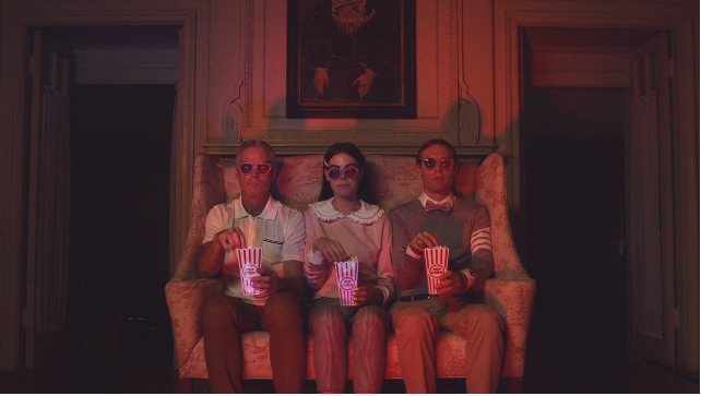
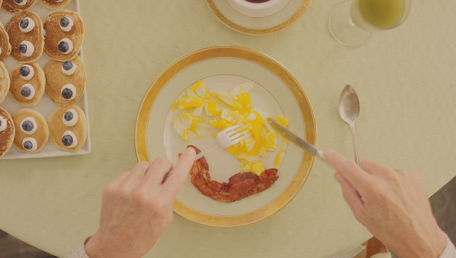
A new ad for Georgetown Optician created by Design Army clearly draws inspiration from filmmaker Wes Anderson. The question is, is it drawing inspiration, is it a parody or both? Or is it ripping off his style entirely?
Here’s the commercial.
For those unfamiliar with Anderson, his movies are filled with quirky characters and beautiful tracking shots which are mostly all symmetrical with gorgeous colors. His style is unique. Here’s examples of his work.
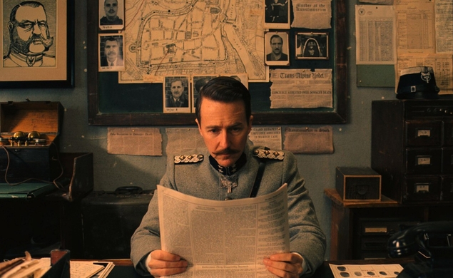
(Via TheDissolve.com)
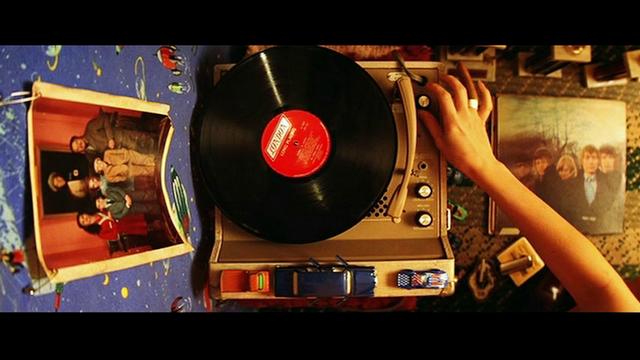
(Via PremiumBeat.com)
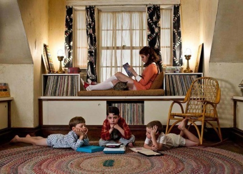
(Via RogerEbert.com)
All of that are present in this commerical. Here’s three stills.
Director and cinematographer Dean Alexander nailed this spot, as it makes an ad for glasses seem extremely engaging.
It’s all quite beautiful honestly. I’m more in line to say this is parody than a blatant rip off, although all of Anderson trademarks are there. The details like the voiceover, the font, the slight eeriness to the whole thing, the kid in the headband – which is right from The Royal Tenenbaums, the monocle placed on the taxidermied goat head, and the wallpaper behind the daughter’s glasses collection are all perfect. I can’t fault this ad for being poorly constructed because it’s not.
But it’s clear the people who made this spot said, ‘how do we make a Wes Anderson-esque commercial, without actually paying Wes Anderson to do it?’ and that leaves a small sour taste in my mouth, for what otherwise is a fantastic commercial.

